Not everybody adores whimsy. Or movies with stilted dialogue, Bill Murray deadpanning, and a cast wearing bobble hats. I do.
Unlike all my other favourite directors, from William Friedkin to Woody Allen through Martin Scorsese to Bill Forsyth and Todd Phillips and Edgar Wright and Michael Bay, Wes Anderson hasn’t made a single dud. Arguably, they get better.
Anderson’s films are really just about what’s going on in his head, nobody else’s
His stop frame animations, The Fantastic Mr Fox and Isle of Dogs, are particular high points because the Wes Anderson weltanschauung can be delivered straight to you, the viewer, unadulterated. The other eight, with actors doing their bit, are good too. But Anderson’s films are really just about what’s going on in his head, nobody else’s. So don’t worry, there won’t be any spoilers here. Dwelling on content, ie the actual script, is to miss the point.
Anderson is about form, static cameras, jokey delivery, ridiculous costume, subtle irony, and reducing pomposity to rubble by means of weaponising mid century design and off-colour colour. Geddit?

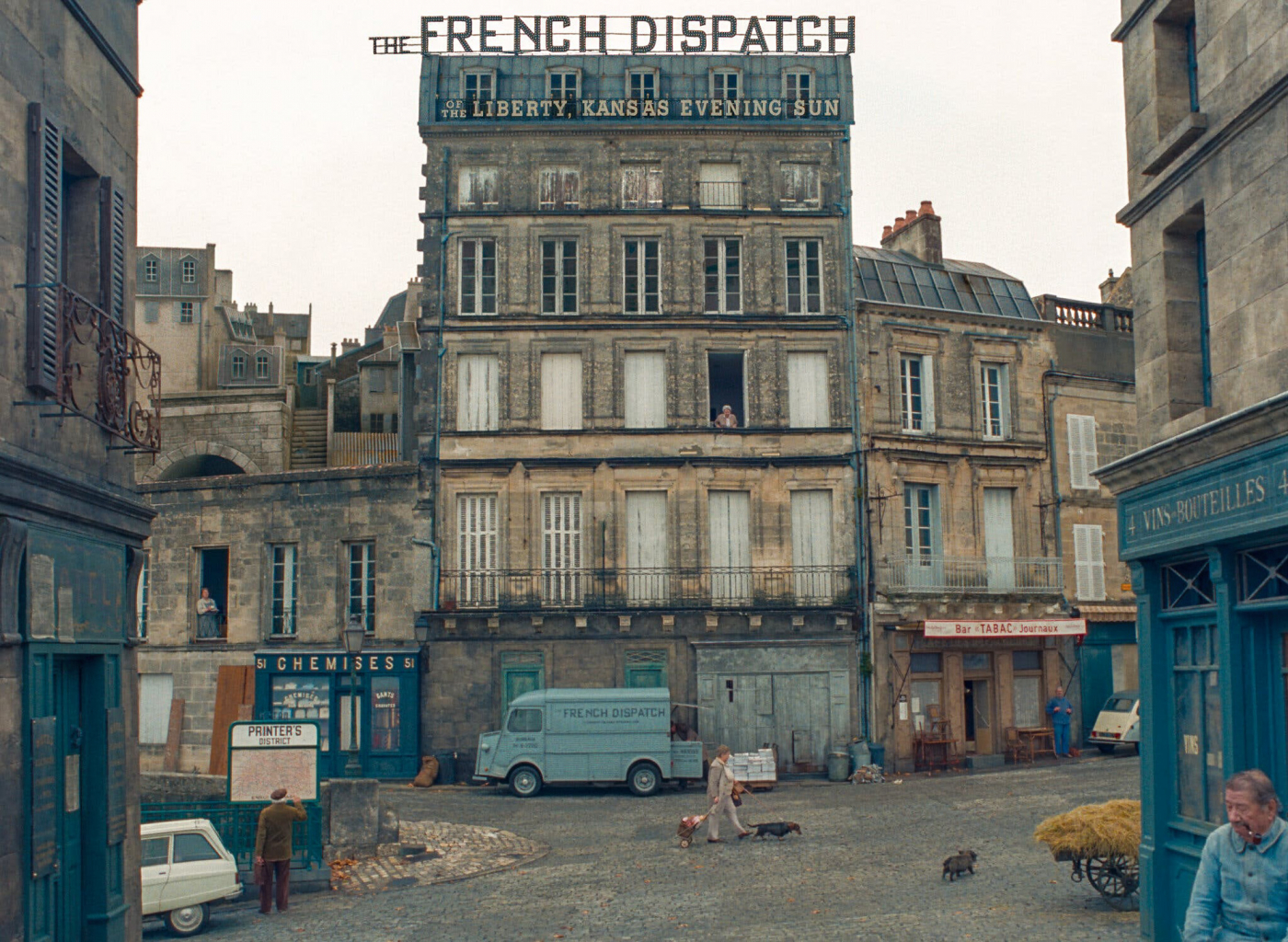
The French Dispatch
This is why there’s now a ludicrous but hugely entertaining web/Instagram site AccidentallyWesAnderson, (which has itself spawned a book), dedicated to real life places which look like they might one day be in a W.A. movie. (Or maybe even were). For purer W.A. nerds (me) there’s an online obsession about his colour palette. Most W.A. movies, once shot and edited, are then colourised within a graded set of shades and hues which create the mood and delight the eye, remastering Kodachrome at will. He could make an entire cowboy out of Farrow & Ball.
In The French Dispatch, the colour palette makes but a brief appearance towards the end in some retro TV studio that looks like Eastern Europe or French regional TV: mad carpet stripes matched with equally zany curtains. Otherwise it’s a random attack in black and white, scattered colours, cartoons, diagramatrons* and then a searing, over-saturated splash of Tilda Swinton resplendent in a shimmering ball gown of such retina damaging orange, we’ll call it Fluorescent Sunny Delight. Rather than put her on a diet of beta carotone to match the frock, Tilda has been gifted false, protruding teeth with which to chomp her way through a script of pretentious art critique so preposterously posh it floats above her head in a word cloud of nonsense worthy of Lear. Wonderful.
Also making brief appearances are the familiar core cast, W.A.’s dedicated troupe. Bill Murray, who’s been in all ten movies, and is ostensibly the lead here as magazine editor, but has precious little screen time, as do Owen Wilson, Adrian Brody, Willem Dafoe, Edward Norton, Jason Schwartzman, and the aforementioned Queen Tilda. All present and correct and all overshadowed by three Hollywood A-listers from the new James Bond, No Time to Die (apart from Daniel Craig who is AWOL), plus Benicio del Toro, customarily seen blasting his way through Sicario or currently Steven Soderbergh’s No Sudden Move and the young hearthrob from Dune that is Timothée Chalamet, brought on to delight with his good looks and be led astray by Frances McDormand.

The French Dispatch
Because this isn’t just whimsy any more, a bunch of hugely talented actors playing at am-dram. This is $25 million dollars worth of whimsy brought to you by Fox Searchlight Pictures, now, coincidentally, owned by Disney and potentially aiming at $100m in revenue, if the train set in motion by Grand Budapest Hotel is anything to go by. The next one down the line, Asteroid City, has already cast Tom Hanks.
Hollywood has found its own highbrow intellectual. Who needs Ingmar Bergman, Fellini, Tarkovsky or Godard when there’s a bright Texan rebel lurking around the arthouses? Who needs another movie messiah when you have a very naughty boy on your doorstep?
And Anderson is indeed mischievous. Because while The French Dispatch purports to be a fictitious French magazine, set in Ennui-sur-blase (wallmaps show it to be remarkably similar to Paris), it is in fact a very thinly disguised New Yorker, the real life magazine Anderson loves, transported to France because The New Yorker, like its readership, loves European sophistication.
He says so in a published memoir, ‘An Editor’s Burial‘ , and credits several real life writers for inspiration. There are typeface similarities and graphically accurate pastiche covers. The format of the film affects to be chapters from this publication, reports on travel, from the world of art, politics and so forth, the kind of thing The New Yorker excels at. They’re not, of course, they’re entertaining filmlets which have a cast of literally hundreds of extras dashing hither and thither or, even more hilariously, standing still, pretending to be freeze frames but wobbling ever so slightly.
But that’s where we must stop all talk of similarity. The New Yorker publisher, Conde Naste, has for some years sought to exploit magazine content for movies: ‘Brokeback Mountain’ was originally a short story by Annie Proulx about gay cowboys in Wyoming, ‘The Hours’, ‘Angela’s Ashes’, and a whole host of other adaptations stretching back as far as Burt Lancaster’s ‘The Swimmer’ and more recently ‘Flash of Genius’.
So yes, a homage to journalism, to the kind of journalism The New Yorker does, to everything there is to like about The New Yorker. But not licensable content. No, not that. Heavens.
Look! There’s Bill Murray deadpanning! C
*diagramatron – The illustrative cut aways of planes, ships, and trains seen in educational magazines which are a hallmark of Wes Anderson movies. A word entirely made up for this article.


