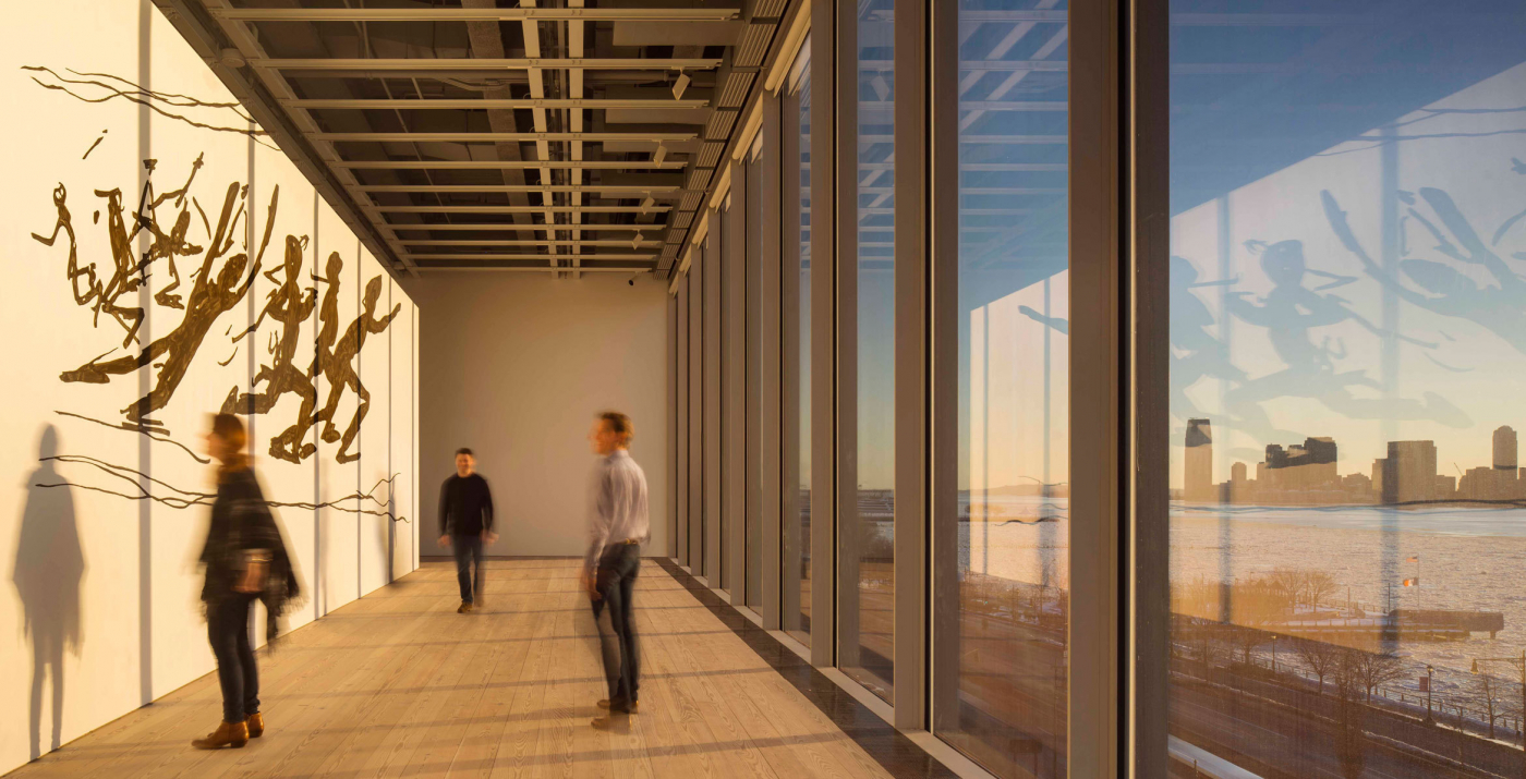
Art confession: I only visited the old Whitney Museum of American Art once, for its final triennial last spring. Since then it’s moved from the beautifully industrial-concrete Marcel Breuer-designed building up on 75th and Madison it occupied for nearly 50 years, to new purposebuilt premises in the Meatpacking District, designed by Renzo Piano, and situated hard by the High Line and the Standard Hotel, those other signifiers of a neighbourhood that has changed radically in little more than a decade. On a Friday night, you can see Whitney visitors crowding its exterior staircases to take pictures of the dramatic sunset over New Jersey while, on street level, hordes of pre-teen girls run screaming down Gansevoort Street, oblivious to the art over their heads.
What the new Whitney lacks in oppressive concrete stairwells and viewing spaces, it makes up for with airy, light-flooded double-height galleries. Its opening gambit is a crowdpleaser, America is Hard to See, a massive survey of American art from the turn of the last century to the present day. Gnomic subtitles (“Raw War”, “Rational Irrationalism”) introduce selections from the Museum’s archive, from instantly recognisable works by de Kooning, Johns, Rothko and Franz Kline to more obscure or contemporary work. I was particularly taken with a small room of industrial paintings from the great age of American factories and construction: girders, pipework, factory skylines, a glorious graphic illustration of the half-made Chrysler Building, all painted with the veneration of Monet for waterlilies. The show tells not just the story of American art but of American history; there is an intensely moving display on AIDS and the artists who documented the progress of the illness and succumbed to it. David Wojnarowicz’s 1989 portrait of the photographer Peter Hujar, taken seconds after Hujar’s death, hangs beside a photograph by Hujar of Wojnarowicz, David Lighting Up, taken near the then-notorious gay cruising grounds at Chelsea Piers, themselves long since eradicated in the transformation of this area into a place where the Whitney could contemplate basing itself.
Naturally, any big show like this has its omissions. There’s a distinct lack of video art – of barely half a dozen pieces, there are two by Nam Jun Paik – and there is what seemed to me a problematic little corner devoted to images of black jazz musicians, including some caricatures that border on the offensive. The wall text strains to note that Miguel Covarrubias’s image of two big-lipped, shiny-teethed jazz musicians was designed to “honour” rather than offend, but in 2015 it looks a bit infra dig to give it preferential wall space.
This is a brisk, enjoyable tour through American art, setting out the stall for what this new Whitney will show. Any omissions are likely to be remedied in future, more specific shows; for now, attention is as much on the building as much as on the works displayed. C
Whitney Museum of American Art, 99 Gansevoort St, New York, NY 10014 USA
+212 570 3600; whitney.org


