Redesigning Gotham – Roman and Williams | Viceroy New York and The Monarch Room
Roman and Williams’ new Manhattan interiors are classic, dark, old New York City

Roman and Williams’ new Manhattan interiors are classic, dark, old New York City

Much of the charm of Manhattan is in its fast disappearing feculence. Before he sipped his last, longtime Chelsea Hotel resident Dylan Thomas hailed the city as “Newfilthy York” – a place he loved and would never leave (and indeed didn’t). The patina that makes much of New York so special is being eroded on a seemingly daily basis – dive bars are disappearing (RIP Milady’s), the once mighty Kim’s empire and Pearl Paint have both bitten the dust, and what price an independent retailer when the monthly rent on St Mark’s Bookshop rockets to north of $20k a month? There aren’t enough signed copies of Just Kids in the world to make that a viable business model. And as for the Chelsea Hotel itself – it doesn’t look like it’s going to win this round. And yet… there is a new generation of locals determined to fight classic Gotham’s corner. And designers Roman and Williams are the city’s undefeated heavyweights.
They could be sets from the most noirish Batman to go before a movie camera. Both have a touch of the night about them
Husband and wife duo Robin Standefer (previously a production designer) and Stephen Alesch (a film set designer) have fashioned an aesthetic that is new old New York. Their dark, rough luxe interiors for Ace Hotel, the Breslin, The High Line Hotel et al are a brilliant exercise in selling New York’s identity back to itself. They’ve been the subject of a leather bound Rizzoli monograph, and their chiaroscuro style has been copied in every corner of the globe via the combination of subway tiling, dulled Deco-era brass finishings and filament bulbs. It’s easy to sneer at some of the aesthetic today as trite, but Roman & Williams is a design studio run by visionaries, up there with Gio Ponti in terms of creating holistic commercial interiors that have an enormous sense of presence. It’s not their fault that everyone copied them.
Roman and Williams’ two latest projects, Viceroy New York – a luxury hotel two blocks from Central Park South – and The Monarch Room, downtown, demonstrate just how powerful and impressive their look continues to be. These aren’t bright, easy or cosy spaces. They could be sets from the most noirish Batman to go before a movie camera. Both have a touch of the night about them, and mix vintage New York motifs with just enough global modernity to make them fresh and exotic. Roman and Williams may flirt with pastiche, but they never put out.

Deluxe Park suite at Viceroy New York
For visitors to the city looking for a hotel that captures the New York spirit, Viceroy New York is just the ticket. It’s not perfect, but then few of New York’s treasures are. It’s a narrow building which makes much of its floorplan, although that doesn’t extend to much of a lobby scene – the ground floor restaurant, Kingside, doesn’t really feel integrated into the hotel as a whole. The penthouse level bar, The Roof, suffers from the same issues that hotel bars with great views suffer the world over: the crowd is invariably non-U, and sizable. I visited on a Friday evening at 7pm, after having been told at check-in earlier that reservations weren’t necessary. Of course, when I arrived, every single seat on the terrace, with its glorious Park view framed on one side by the iconic Essex House sign, was taken. “We aren’t taking any more reservations for outside,” I was told, “so it’s just a case of grabbing a seat where you can.” I savoured the spectacular view for a moment, grabbed a seat on the F train and went for drinks in the basement of Nitecap on the Lower East Side instead.
The real draw of Viceroy New York isn’t The Roof, or the lobby (although the marble and the grand movie-set style murals are lovely pieces of Metropolis chic), but the design details of the bedrooms themselves. Given that the common areas of any hotel in this part of the city are going to be riddled with rubes and Eurotrash, that’s as it should be.

The lobby at Viceroy New York
I stayed in a Park Suite, which has the same view as The Roof, but without hoi polloi. All of the custom made furniture is bolted to the floor, as if we may be on a boat, or rather – looking out and down at the canyons of Midtown below – an airship. There is a modular desk and chair, and a counter with a stool beside a strip-paneled wooden bar kitchen and bar area. The lounge has a tan leather buttoned couch with brass finish and the TV in the bedroom is mounted, purposely off-centre, within a wooden cabinet with a wooden strip light above it – half finished with a woven front. The look is dark Deco, mixed with G-Plan, by way of Prouvé’s Le Maison Tropicale. It’s gorgeous. I’m already fretting about what’s going to happen to the interior when it’s inevitably refurbished.
The look is dark Deco, mixed with G-Plan, by way of Prouvé’s Le Maison Tropicale
As far as the practicalities, bells and whistles go, the hi-tech wifi system, which allows you to tether your various devices to the in room stereo and TV to play, was glitchy when I tried it. But the Beats by Dre stereo allowed me to play music from my phone by Bluetooth perfectly. The only thing I’d really change in the room is the shower. Yes, it looks the industrial-age part, but I’d rather trade look for function. Oh, and the lift up… it’s one thing to have Nelly Furtado playing, but that incessant irregular beeping as it speeds or slows past floors has to go.
The most beautiful thing about Viceroy New York is that it wouldn’t make sense anywhere else. It’s a uniquely New York City, and indeed Manhattan, hotel. As, indeed, is the Monarch Room, which is a reboot of the restaurant-as-nightclub concept that I thought had peaked a long time ago, around the time of Buddakan.

The Monarch Room
Arriving at The Monarch Room at 9pm on a Thursday is a shock to the system. Once through the foyer and past the inside doors, the noise hits you like a tweaking, particularly heavyset Patrick Bateman rushing you with a baseball bat. “Oh God this is horrible,” groaned my dining companion, as we waited for our table. Then he said it again, and again, until he was actually shouting, which was the volume it needed to be at for me to work out what he was actually saying. We took our seats like Statler and Waldorf on a night out, sighed, sent back a glass of flat Veuve, and geared up to enjoy hating everything.
There’s little point taking pot shots at the clientele. This sort of set up will always attract the boisterously wealthy. And the fact that it’s adjacent to the Meatpacking District sends a strong message from the start: many of you reading this won’t want to come here at all (and definitely not at weekends – one can only imagine what staggering-on-heels horrors lurk around these blocks on a Saturday night). I studied the crowd – men in tartan shirts and bodywarmers with infinitely more attractive and better dressed women; big groups of visiting business types having rip-roaring fun and clinking glasses (“Cheers!”), and a few stray fashion types with interesting haircuts and new season Dover Street Market. The staff are styled to the nines, including a gent with a singularly impressive afro and a lady floating around in a white baby doll and heels. The room could serve as a cross-section of much of Manhattan’s downtown residents right now.

The Monarch Room
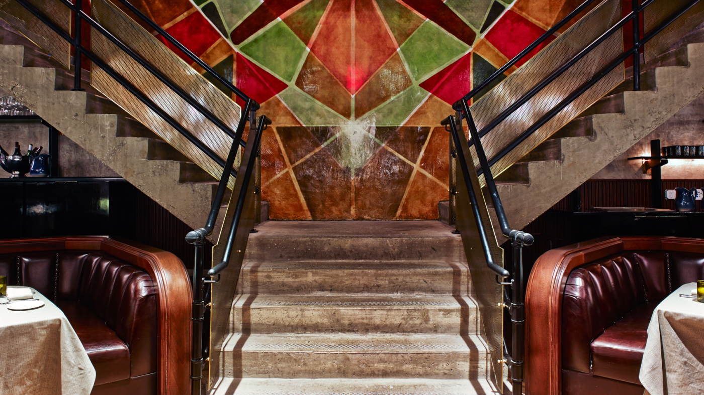
The Monarch Room is absurdly handsome and must have cost a bomb. From the vast length of the space, to the pillars, curved leather booths, oyster bar and circular 1920s-style light fittings, it looks like a futuristic twist on a classic ocean liner. The walls and ceilings have the look of raw concrete, but the spirit comes from dark, deco Manhattan. And, as with other Roman & Williams interiors, there are vivid international twists – the rear wall of the grand staircase has been painted with a huge, floor to ceiling, jewel-like Moorish mural. It’s a masterstroke.
Ever since the its first skyscraper went up, right through to Rhoda trying out a Mary Taylor Moore-style hat toss in Times Square, New York City has been a town that could tell a story and sell itself through a single image
Twenty minutes into my Monarch Room experience, I realized that I had decompressed and was genuinely enjoying it. The curmudgeon had melted away. The room has that sexy, soporific gloaming that seems unique to New York dining rooms and which makes everyone look good. Crucially, the food is very good indeed. I’d assumed that with such a strong focus on the look, that the kitchen would be an afterthought. Chef Michael Citarella has created a modern American menu that’s neither challenging nor pedestrian – just appealing and delicious. An order of fried hen of the woods with buttermilk was a sculptural, delicious, crisp mushroom bouquet. A bowl of parsnip soup with crisp kale was one of the loveliest things I’ve eaten all spring – full of lemon zest. The dry aged strip steak was a perfect piece of cow, well cooked, with some charred scallions. Apart from the addition of some overly piquant chillies, it’s up there with the best in the city. Likewise, a side of crispy cauliflower with pomegranate, capers and parsley is simple but wonderful bit of culinary flash – even if mine arrived at the table a little cool (in a restaurant of this size, the pass in the kitchen must be a fiendish house of cards).
Ever since the its first skyscraper went up, right through to Rhoda trying out a Mary Taylor Moore-style hat toss in Times Square, New York City has been a town that could tell a story and sell itself through a single image. Roman and Williams’ interior at The Monarch Room – like all their best work – captures a mood and an idea of Manhattan in a single shot. Like images of Studio 54 and the Palladium, people will see it in magazines and on websites from Paris to Melbourne and long to step inside and experience it. It’s spectacular and exciting but it’s still dark. Which is the essence of classic New York to a tee. C
The Monarch Room, 408 W 15th St, New York, NY 10011 USA
+646 790 7070; nymonarchroom.com
Viceroy New York, 120 W 57th St, New York, NY 10019 USA
+212 830 8000; viceroyhotelsandresorts.com